<html>
<head>
<meta name="description" content="Pmw - a toolkit for building high-level compound widgets in Python">
<meta name="content" content="python, megawidget, mega widget, compound widget, gui, tkinter">
<title>Pmw.MessageDialog reference manual</title>
</head>
<body bgcolor="#ffffff" text="#000000" link="#0000ee"
vlink="551a8b" alink="ff0000">
<h1 ALIGN="CENTER">Pmw.MessageDialog</h1>
<center><IMG SRC=MessageDialog.gif ALT="" WIDTH=309 HEIGHT=220></center>
<dl>
<dt> <h3>Name</h3></dt><dd>
<p>Pmw.MessageDialog() -
a dialog displaying a text message and an icon
</p>
</dd>
<dt> <h3>Inherits</h3></dt><dd>
<a href="Dialog.html">Pmw.Dialog</a><br>
</dd>
<dt> <h3>Description</h3></dt><dd>
<p>
A message dialog is a dialog window which displays a simple
message to the user along with one or more buttons to press.</p>
<p></p>
</dd>
<dt> <h3>Options</h3></dt><dd>
Options for this megawidget and its base
classes are described below.<p></p>
<a name=option.activatecommand></a>
<dl><dt> <strong>activatecommand
</strong></dt><dd>
If this is callable, it will be called whenever the megawidget is
activated by a call to <code>activate()</code>. The default is <strong>None</strong>.</p>
</dd></dl>
<a name=option.borderx></a>
<dl><dt> <strong>borderx
</strong></dt><dd>
Initialisation option. The padding to the left and right of the text message and icon. The default is <strong>20</strong>.</p>
</dd></dl>
<a name=option.bordery></a>
<dl><dt> <strong>bordery
</strong></dt><dd>
Initialisation option. The padding above and below the text message and icon. The default is <strong>20</strong>.</p>
</dd></dl>
<a name=option.buttonboxpos></a>
<dl><dt> <strong>buttonboxpos
</strong></dt><dd>
Initialisation option. Specifies on which side of the dialog window to place the button
box. Must be one of <strong>'n'</strong>, <strong>'s'</strong>, <strong>'e'</strong> or <strong>'w'</strong>. The default is <strong>'s'</strong>.</p>
</dd></dl>
<a name=option.buttons></a>
<dl><dt> <strong>buttons
</strong></dt><dd>
This must be a tuple or a list and specifies the names on the
buttons in the button box. The default is <strong>('OK',)</strong>.</p>
</dd></dl>
<a name=option.command></a>
<dl><dt> <strong>command
</strong></dt><dd>
Specifies a function to call whenever a button in the button box
is invoked or the window is deleted by the window manager. The
function is called with a single argument, which is the name of
the button which was invoked, or <strong>None</strong> if the window was deleted
by the window manager.</p>
<p> If the value of <strong>command</strong> is not callable, the default behaviour
is to deactivate the window if it is active, or withdraw the
window if it is not active. If it is deactivated, <code>deactivate()</code>
is called with the button name or <strong>None</strong> as described above. The default is <strong>None</strong>.</p>
</dd></dl>
<a name=option.deactivatecommand></a>
<dl><dt> <strong>deactivatecommand
</strong></dt><dd>
If this is callable, it will be called whenever the megawidget is
deactivated by a call to <code>deactivate()</code>. The default is <strong>None</strong>.</p>
</dd></dl>
<a name=option.defaultbutton></a>
<dl><dt> <strong>defaultbutton
</strong></dt><dd>
Specifies the default button in the button box. If the <strong><Return></strong>
key is hit when the dialog has focus, the default button will be
invoked. If <strong>defaultbutton</strong> is <strong>None</strong>, there will be no default
button and hitting the <strong><Return></strong> key will have no effect. The default is <strong>None</strong>.</p>
</dd></dl>
<a name=option.iconmargin></a>
<dl><dt> <strong>iconmargin
</strong></dt><dd>
Initialisation option. The padding between the text message and icon. The default is <strong>20</strong>.</p>
</dd></dl>
<a name=option.iconpos></a>
<dl><dt> <strong>iconpos
</strong></dt><dd>
Initialisation option. Specifies on which side of the text message to place the icon.
Must be one of <strong>'n'</strong>, <strong>'s'</strong>, <strong>'e'</strong> or <strong>'w'</strong>. The default is <strong>None</strong>.</p>
</dd></dl>
<a name=option.master></a>
<dl><dt> <strong>master
</strong></dt><dd>
This is used by the <code>activate()</code> method to control whether the
window is made <em>transient</em> during modal dialogs. See the
<code>activate()</code> method. The default is <strong>'parent'</strong>.</p>
</dd></dl>
<a name=option.separatorwidth></a>
<dl><dt> <strong>separatorwidth
</strong></dt><dd>
Initialisation option. If this is greater than <strong>0</strong>, a separator line with the specified
width will be created between the button box and the child site,
as a component named <strong>separator</strong>. Since the default border of the
button box and child site is <strong>raised</strong>, this option does not
usually need to be set for there to be a visual separation between
the button box and child site. The default is <strong>0</strong>.</p>
</dd></dl>
<a name=option.title></a>
<dl><dt> <strong>title
</strong></dt><dd>
This is the title that the window manager displays in the title
bar of the window. The default is <strong>None</strong>.</p>
</dd></dl>
</dd>
<dt> <h3>Components</h3></dt><dd>
Components created by this megawidget and its base
classes are described below.<p></p>
<a name=component.buttonbox></a>
<dl><dt> <strong>buttonbox
</strong></dt><dd>
This is the button box containing the buttons for the dialog. By
default it is created with the options
<code>(hull_borderwidth = 1, hull_relief = 'raised')</code>. By default, this component is a <a href="ButtonBox.html">Pmw.ButtonBox</a>.</p>
</dd></dl>
<a name=component.dialogchildsite></a>
<dl><dt> <strong>dialogchildsite
</strong></dt><dd>
This is the child site for the dialog, which may be used to
specialise the megawidget by creating other widgets within it. By
default it is created with the options
<code>(borderwidth = 1, relief = 'raised')</code>. By default, this component is a Tkinter.Frame.</p>
</dd></dl>
<a name=component.hull></a>
<dl><dt> <strong>hull
</strong></dt><dd>
This acts as the body for the entire megawidget. Other components
are created as children of the hull to further specialise this
class. By default, this component is a Tkinter.Toplevel.</p>
</dd></dl>
<a name=component.icon></a>
<dl><dt> <strong>icon
</strong></dt><dd>
If the <strong>iconpos</strong> option is not <strong>None</strong>, this component is created
to contain the icon label for the dialog. To display a bitmap as
an icon, set the <strong>icon_bitmap</strong> component option to any of the
forms acceptable to Tk, such as <strong>'warning'</strong> or <strong>'error'</strong>. By default, this component is a Tkinter.Label.</p>
</dd></dl>
<a name=component.message></a>
<dl><dt> <strong>message
</strong></dt><dd>
The label to contain the text message for the dialog. To set
the text, use the <strong>message_text</strong> component option. By default, this component is a Tkinter.Label.</p>
</dd></dl>
<a name=component.separator></a>
<dl><dt> <strong>separator
</strong></dt><dd>
If the <strong>separatorwidth</strong> initialisation option is non-zero, the
<strong>separator</strong> component is the line dividing the area between the
button box and the child site. By default, this component is a Tkinter.Frame.</p>
</dd></dl>
</dd>
<a name=methods></a>
<dt> <h3>Methods</h3></dt><dd>
This megawidget has no methods of its own.
For a description of its inherited methods, see the
manual for its base class
<strong><a href="Dialog.html#methods">Pmw.Dialog</a></strong>.
<p></p>
</dd>
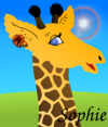
<dt> <h3>Example</h3></dt><dd>
The image at the top of this manual is a snapshot
of the window (or part of the window) produced
by the following code.<p></p>
<pre>
class Demo:
def __init__(self, parent):
self.parent = parent
# Create dialog 1.
self.dialog1 = Pmw.MessageDialog(parent,
title = 'Simple message dialog',
defaultbutton = 0,
message_text = 'A simple message dialog\nwith no callback.')
self.dialog1.iconname('Simple message dialog')
self.dialog1.withdraw()
# Create dialog 2.
self.dialog2 = Pmw.MessageDialog(parent,
title = 'Bell ringing dialog',
message_text = 'This message dialog\nwill ring the bell ' +
'when\nyou click on the buttons.',
iconpos = 'w',
icon_bitmap = 'error',
command = self.execute2,
buttons = ('One', 'Two', 'Three', 'Close'))
self.dialog2.iconname('Bell ringing dialog')
self.dialog2.withdraw()
# Create dialog 3.
self.dialog3 = Pmw.MessageDialog(parent,
title = 'Vertical button dialog',
message_text = 'This message dialog\nhas the buttons on the\n' +
'right hand side.',
buttonboxpos = 'e',
iconpos = 'n',
icon_bitmap = 'warning',
buttons = ('Goodbye', 'Au revoir', 'Sayonara', 'Close'),
defaultbutton = 'Close')
self.dialog3.iconname('Vertical button dialog')
self.dialog3.withdraw()
# Create some buttons to launch the dialogs.
w = Tkinter.Button(parent, text = 'Simple dialog',
command = lambda self = self:
self.dialog1.activate(geometry = 'first+100+100'))
w.pack(padx = 8, pady = 8)
w = Tkinter.Button(parent, text = 'Bell ringing dialog',
command = self.dialog2.activate)
w.pack(padx = 8, pady = 8)
w = Tkinter.Button(parent, text = 'Vertical buttons',
command = self.dialog3.activate)
w.pack(padx = 8, pady = 8)
w = Tkinter.Button(parent, text = 'On the fly dialog',
command = self._createOnTheFly)
w.pack(padx = 8, pady = 8)
def execute2(self, result):
print 'You clicked on', result
if result is None:
self.dialog2.deactivate(result)
elif result == 'Close':
self.dialog2.deactivate(result)
else:
for count in range({'One': 1, 'Two': 2, 'Three': 3}[result]):
if count != 0:
self.dialog2.after(200)
self.dialog2.bell()
def _createOnTheFly(self):
dialog = Pmw.MessageDialog(self.parent,
title = 'On the fly dialog',
defaultbutton = 0,
buttons = ('OK', 'Apply', 'Cancel', 'Help'),
message_text = 'This dialog was created when you clicked ' +
'on the button.')
dialog.iconname('Simple message dialog')
result = dialog.activate()
print 'You selected', result
</pre>
</dd>
</dl>
<center><P ALIGN="CENTER">
<IMG SRC = blue_line.gif ALT = "" WIDTH=320 HEIGHT=5>
</p></center>
<font size=-1>
<center><P ALIGN="CENTER">
Pmw 1.3 -
7 Aug 2007
- <a href="index.html">Home</a>
<br>Manual page last reviewed: 18 May 2002
</p></center>
</font>
</body>
</html>
distrib
>
Mandriva
>
2010.0
>
i586
>
media
>
contrib-release
>
by-pkgid
>
05248f0b87ae2946b55dc9a0903fb574
>
files
>
190